Si, en Español.
Sin embargo, me ha olvidado quizás el aspecto más importante de la API de mesa: la clasificación. As mentioned in my last post, sorting is really the only thing that the table wrapper API actually does for you, except for the whole drawing the table thing. Sorting takes the form of two parameters: The name of the column to sort by, and a boolean value that’s true if you want to sort by increasing values and false otherwise. If you so desire, you can just ignore these variables, and the API will automatically sort the second column by increasing value.
Sorting a table looks sort of like this:
// Sort by descending profit (Highest value first)
chart_draw_table( $columns, $chartdata, "Profit", false );
Also, the last post had invalid code, so I implemented a new feature to navigate around that (so now it’s valid code): Concatenation. Concatenation allows you to splotch more than one data array together to create the overall data array. It’s very simple: instead of passing one data argument, you pass more than one data argument! All of the following are valid:
$data1 = <Some chart data>;
$data2 = <Some more chart data>;
$chartdata = array(0 => array( 'data' => $data1));
$chartdata = array(0 => array( 'data' => array($data1)));
$chartdata = array(0 => array( 'data' => array($data1, $data2)));
$chartdata = array(0 => array( 'data' => array($data1, [key] => [value] ... )));
And all of the following are invalid (It’ll tell you what and why, so don’t fret too much):
$chartdata = array(0 => array( 'data' => array(array($data1))));
(Note: These cases are almost predominantly because data is nested)
Sorting Columns By Keys
Sorting by keys. In the process of testing the many improvements, I noticed that basic line charts do not handle missing data very well. Admittedly, the very concept of ‘missing data’ makes it hard to say what should happen. Either way, what used to happen is that time stamps were shown in the order that we came across them. If the first series went {0, 1, 2, 4, … } and the second series went {0, 2, 3, 4, … }, then the order of values on the X-axis were as follows: {0, 1, 2, 4, … , 3} and the second series would have a gap at X=1.
We still process the data the same way, but we sort it afterwards: So what we’d end up with would be {0, 1, 2, 3, 4, … }. This comes in handy everywhere EXCEPT where strings are used as the key:


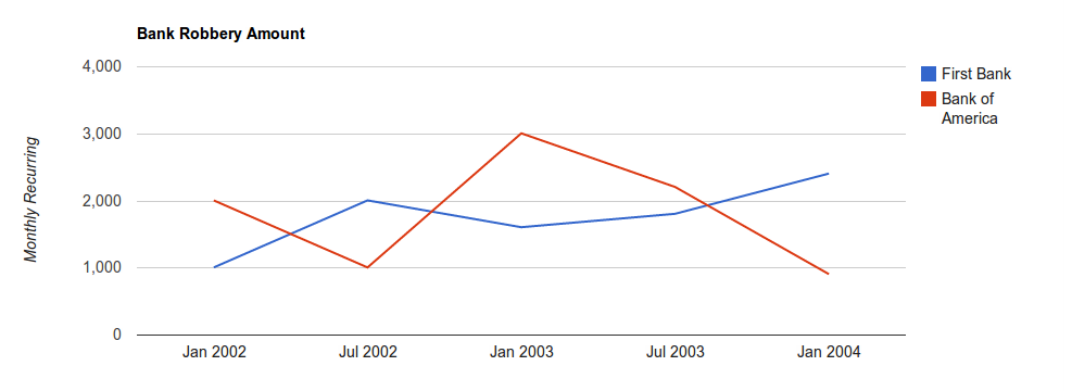
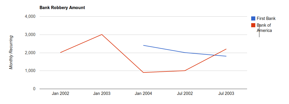
These charts show the amount I get from my night job.
The first chart shows all of the data for these test graphs. It is important to note here that First Bank was the first series specified. The second graph shows what happened after I removed the January 2003 data point for First Bank. Notice how the order of the tags along the bottom is messed up: July 2002 comes after January 2004, etc. (A little off topic, but it is worth noticing how the keys are evenly spaced along the length of the X-axis)
Ideally, you don’t use strings as keys. Sometimes, though, strings must be used and you have no choice. This is where you use the ‘column_sort’ meta tag:

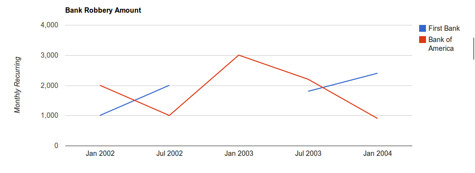
The above graph is the second graph after I used the column_sort tag. The value for this tag is just an array in the order that you want the columns to appear in. For example:
$chartmeta = array('title' => 'Bank Robbery Amount',
 'vaxis_title' => 'Monthly Recurring', 'width' => 1000,
 'column_sort' => array('Jan 2002', 'Jul 2002', 'Jan 2003',
                        'Jul 2003', 'Jan 2004'));
$chartdata = array(0 =>  array( 'title' => 'First Bank',
 'data' => array('Jan 2002' => 1000, 'Jul 2002' => 2000,
                 'Jul 2003' => 1800, 'Jan 2004' => 2400))
                  ,1 =>  array( 'title' => 'Bank of America',
 'data' => array('Jan 2002' => 2000, 'Jul 2002' => 1000,
                 'Jan 2003' => 3000, 'Jul 2003' => 2200,
                 'Jan 2004' => 900))
                  );
chart_draw_linechart($chartmeta, $chartdata);
There is another option out there, called ‘dont_sort_columns_by_key’. By default, columns are sorted by keys even if column_sort isn’t specified. Setting this option to true will disable this feature, and the order of the keys will be left untouched. This option disables column_sort, as well.
Interpolation & Miscelaneous
One thing to point out is that the graphs above do not interpolate over the missing values. This doesn’t happen in timeline charts, which automatically interpolates over missing values. However, if you want, then in a basic line chart you can pass ‘interpolate_nulls’ as true in the meta list. If that is set to true, then missing values will be interpolated:

There are limits to all of this madness. Basic line charts are allowed to have a maximum of 150 data points per series, but may have as many series’s as PHP has memory. This maximum is an ‘invisible limit’ - You don’t have to worry about it. The wrapper pulls out any extraneous data transparently, point being that only 150 data points will ever be drawn per series.
Timelines have more complex limits. A timeline has a limit of 100 series’s, but there is no limit to the number of data points per series. This ceiling can be lowered (but not raised), using the ‘max_series’ meta tag.
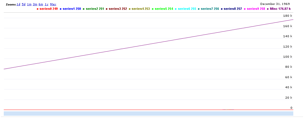
Why? Because a) having 100 series is slow and b) everything else is thrown together as ‘miscellaneous’. The timeline wrapper takes the first so many series’s and displays them (first being in the internal array pointer order). Everything else is drawn as ‘miscellaneous’. However, sometime you may not want to show the miscellaneous, as in this example:

The miscellaneous seriously outweighs the others. Big time. To disable the miscellaneous, simply set ‘disable_misc’ to true in the meta.
Summary
- Concatenation on timeline & line charts
- Sorting tables
- Sorting basic line graph X-axis values
- Interpolating on timeline & line charts (interpolate_nulls meta value)
- Miscellaneous Values (disable_misc meta value)
- Limits (150 points on basic line chart, 100 series’s on timeline chart)
Note: All meta values are optional. This is a valid meta array: array().
Warning: You may not like the defaults.
